
TL;DR
• Your monthly social media report isn't a bureaucratic formality — it's the one moment you actually stop, look at the data, and make informed decisions.
• There are three ways to do it: manually in Excel, with a visualization tool like Looker Studio or Power BI, or with an AI-powered analytics tool. Each one adds a layer of depth the previous one doesn't have.
• If you use Welov, you can generate AI-powered reports in minutes across four different analysis types: profile, brand, benchmark, and content themes.
• The best template isn't the prettiest one. It's the one you actually fill out every single month.
WHY YOU SHOULD TRACK SOCIAL MEDIA EVERY MONTH (NOT JUST WHEN SOMEONE ASKS FOR IT)
It's the first Friday of April. You've spent two hours copying numbers from four different platforms into a spreadsheet that already had too many tabs, too many colors, and way too much data nobody was actually going to read. You hit send. You get an "ok." And next month you do the exact same thing.
That endless loop — collect, paste, format, send, forget — is what monthly reporting looks like for a lot of social media managers. Not because they don't want to produce something useful. But because without a system, the report becomes a chore. And chores don't move the needle.
A well-built monthly social media report does the opposite. It lets you catch that a content theme has been losing engagement for three months before someone above you points it out. See whether a follower spike was a real trend or just a one-off. Have concrete data when you need to argue for a strategy change, justify a pivot, or simply defend the work you've been doing.
The difference between those two scenarios isn't hours spent. It's having a template that forces you to look at what matters, in the right order, without the process eating up your entire day.
A good monthly social media report template doesn't solve the problem at its root — that requires a complete analytics system — but it does reduce execution time enough to make the analysis actually happen.
HOW TO BUILD YOUR MONTHLY REPORT: THREE OPTIONS AND WHEN EACH ONE MAKES SENSE
There's no single right way to do a monthly social media report. It depends on your team size, how many profiles you manage, what stakeholders expect, and what you need to see to make decisions.
Think of the three options as layers: each one adds something the previous one doesn't have.
The next sections break down how each option works, what to include, and how to get the most out of it.
YOUR MONTHLY SOCIAL MEDIA REPORT IN EXCEL (OR GOOGLE SHEETS)
If you manage one or two profiles and reporting isn't your main workload, Excel or Google Sheets can be more than enough. You don't need to build a data infrastructure to know whether your social media is working.
What you do need is structure. A well-designed sheet, built once, saves you rebuilding it every month.
Tracking social media in Excel: the basics
For each platform, create a tab or section with these columns:
• Date / Period
• Followers at the start of the month
• Followers at the end of the month (+ net change)
• Total posts (broken down by format if relevant)
• Total reach / Total impressions
• Total interactions (likes + comments + saves + shares)
• Average interactions per post
• Average engagement rate (by followers or by impressions — pick one and stick with it)
• Top 3 posts of the month (link + metrics)
• Worst-performing post
• Month notes (active campaigns, algorithm changes, anything unusual)
Charts that actually get used
You don't need to fill the report with charts. Three well-chosen ones are enough:
• Average interactions per post, month over month (line chart). Tells you if you're growing or plateauing.
• Engagement rate by week or by content type (bar chart). Tells you what's working.
• Impressions by format for the month (pie or stacked bar). Tells you where to focus.
Everything else is decoration. Too many charts make the report hard to read and nobody draws clear conclusions from it.
Pros and cons
✅ Zero cost. Full freedom to include whatever metrics you want and format it however you need. Easy to share with anyone without requiring access to any tool.
❌ Cross-period comparisons are manual: if you want to see how your engagement rate has evolved over the past six months, you need to pull historical data and calculate it yourself. Format breakdowns also require extra work. And if you're managing more than two or three profiles, the spreadsheet gets unmanageable fast. Not a solution for teams that want to scale. Add human error risk on top of that.
If you want to think through how to structure your analysis before building your sheet, this article on how to create a social media report gives you the complete framework to start on solid ground.
MONTHLY REPORTING WITH DATA VISUALIZATION TOOLS
If you manage a lot of profiles, handle multiple clients, or your monthly report needs to always follow the same format, a dashboard connected to your data sources changes the game entirely. This is the second layer: data visualizes itself, no manual copy-pasting required.
The key difference from Excel is that here you don't make the report — the report makes itself. You configure the connections and visualizations once, and every month the data updates automatically.
Looker Studio is the most accessible option. It's free, connects to Google Analytics, Google Ads, and many social platforms through third-party connectors, and has a reasonable learning curve if you're already comfortable with spreadsheets.
Power BI is the alternative for more corporate environments or when you need to connect data from more complex sources: CRMs, ad platforms, custom data exports. More powerful than Looker Studio, but also more setup time and, in many cases, a paid license.
Recommended modules for your monthly dashboard
Regardless of the tool, a well-built social media dashboard should have at least these blocks:
• Executive summary: total followers, net growth, total reach and impressions, engagement rate, total interactions. One page, big numbers, for the leadership meeting.
• Performance by platform: the same metrics broken down by channel. To see which network is carrying and which is falling behind.
• Performance by format: which content type (video, carousel, static image, stories, etc.) drives the most engagement rate and best average interactions per network.
• Trend over time: follower and engagement rate trend lines over the past 3–6 months. To distinguish real growth from one-off spikes.
• Top content of the month: best-performing posts with direct links and key metrics.
Pros and cons
✅ Once set up, reporting is nearly automatic. The format is always consistent, which makes cross-period comparisons easy. It's the most scalable option if you handle many profiles or clients — with deeply customizable visualizations.
❌ They don't generate direct analysis: they show your data clearly, but the interpretation and conclusions are all on you. If you need to understand what's behind the numbers — not just see them — these tools won't get you there. The initial setup also requires a real time investment, especially if you're not already comfortable with this type of technology.
MONTHLY REPORTING WITH A SOCIAL MEDIA ANALYTICS TOOL
This is the third layer, and the one that changes the type of questions you can actually answer. Social media analytics tools don't just let you visualize data — they interpret it. Some come with pre-built report templates you can export directly. Others let you customize which metrics to include, how to visualize them, and who to send them to.
The difference between them is whether the report stops at data or goes a step further and actually tells you something about what's behind those numbers.
Welov, for example, has a feature called AI-powered content reports that generates qualitative analysis on your profiles, your brand, competitors, or content themes. It doesn't just tell you how many likes you got — it explains why one type of content outperforms another, what your competitors are doing that you're not, and what patterns keep showing up in your highest-performing posts.
Pros and cons
✅ Report generation time drops dramatically. Direct platform connections eliminate manual copy-paste. The qualitative AI analysis layer adds something neither Excel nor dashboards can give you: you don't just see what happened, you actually understand why.
❌ Metric customization has limits: if you need to cross-reference very specific data or combine sources outside the tool's ecosystem, you might not get there. You're working within the framework the tool provides, and sometimes that falls short for very particular reporting needs.
Below you'll find four report types, what each one should include, and what it's actually useful for.
Report for competitor analysis
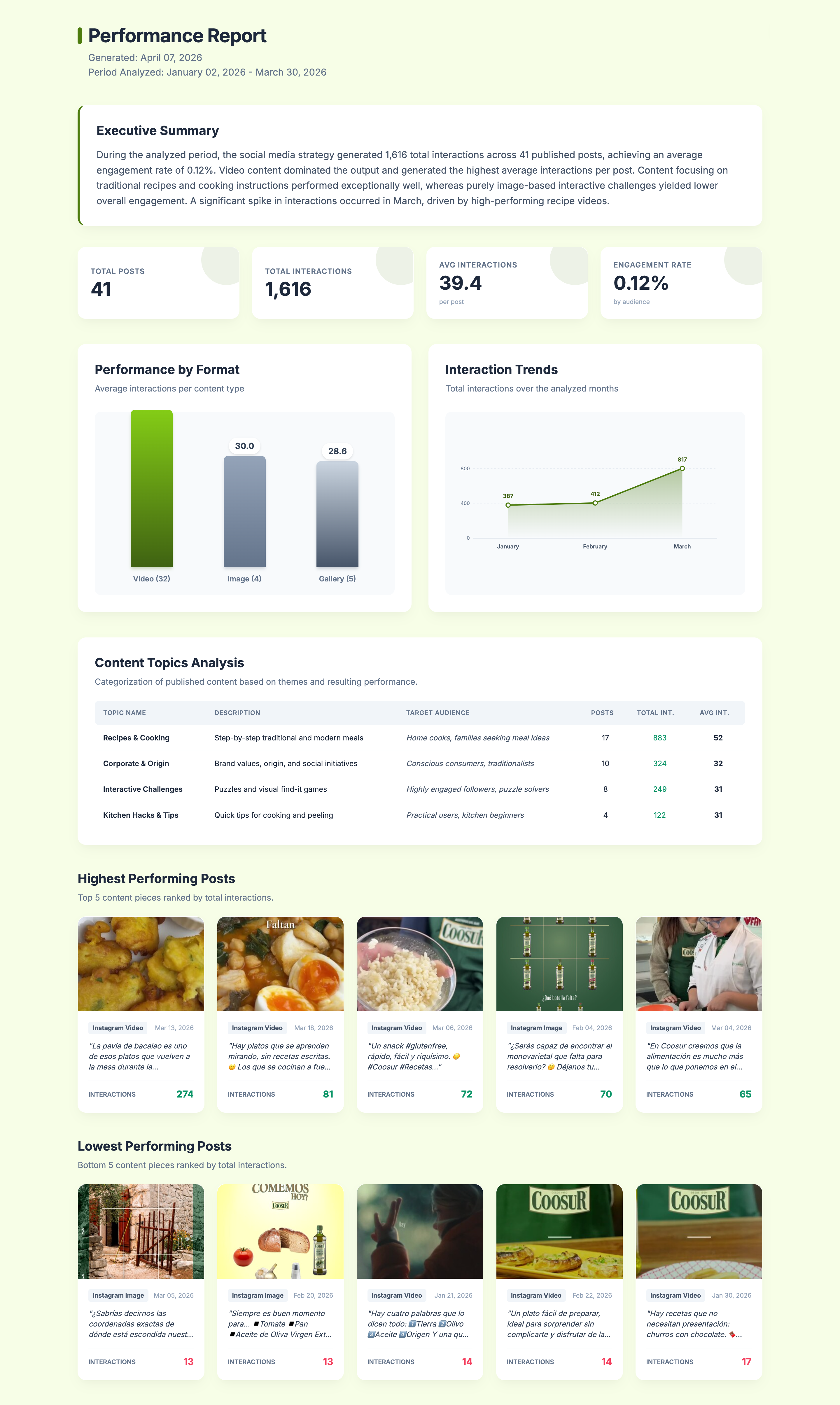
When you start working with a new brand, put together a pitch, or simply want to understand how a profile is performing (yours or a competitor's), this type of report gives you the most complete picture for whatever time period you choose.
It's not a metrics dump. The report identifies which content themes the profile uses, which audience each one targets, which formats dominate, and which posts concentrate the most performance — all with an executive summary you can present without editing.
What a competitor (or profile) analysis report should include:
• Executive summary with the main patterns for the period
• Key metrics: total interactions, engagement rate, posts published, and average interactions per post
• Performance by format (video, image, carousel/gallery)
• Engagement trend over time, month by month
• Content themes: description, target audience for each, total posts, total interactions, and average per post
• Top 5 highest-impact posts
• Lowest-performing posts
Report for analyzing your brand
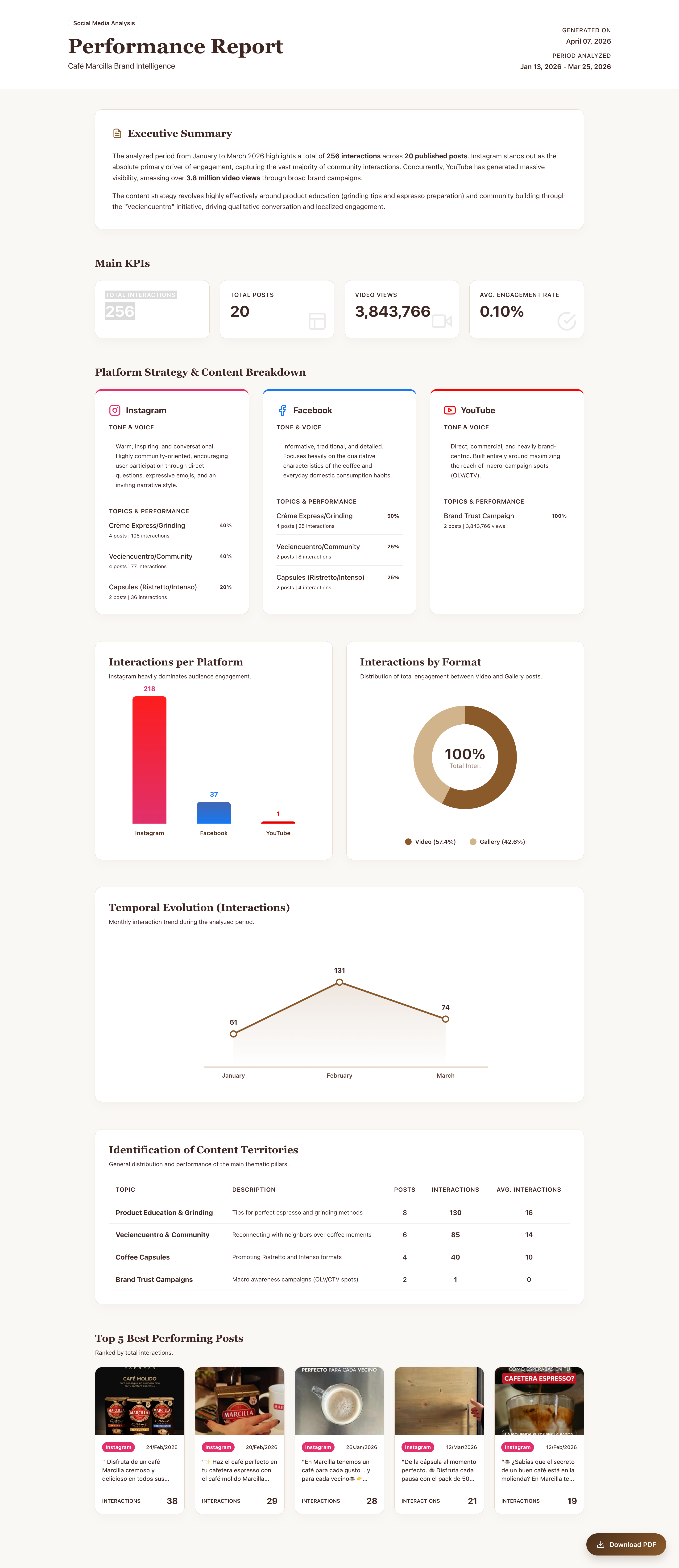
Sometimes you don't need the detail of a single platform. You need to see how your brand communicates as a whole: whether the tone is consistent across Instagram and YouTube, whether the themes you use most are the ones generating the most engagement, whether one network is pulling weight and another is running on autopilot.
This report cross-references all your brand's active networks for the analyzed period and gives you a global view with a platform-by-platform breakdown.
What a multi-platform brand report should include:
• Executive summary: overall strategy patterns for the period
• Global metrics: total interactions, engagement rate, total views
• Platform-by-platform analysis: brand tone and voice on each network, themes used and their performance
• Volume comparison across platforms (interactions and posts)
• Format distribution with percentage weight of each content type
• Content territory identification: main description, number of posts, total interactions, and average per post
• Top 5 best-performing posts for the period
Benchmark or industry ranking report
If there are three brands in your sector that always seem to be one step ahead, a benchmark report tells you exactly what they're doing differently. Not just whether they post more or have more followers — but what themes they're using, which format concentrates their engagement rate, and where there's a gap your competitors aren't filling that you could.
The report should always end with actionable recommendations. Not generic takeaways, but concrete next steps for your brand.
What a benchmark report should include:
• Executive summary of the competitive landscape for the analyzed period
• Industry-wide metrics: total interactions, average engagement rate, posts analyzed
• Platform distribution per competitor
• Comparative performance across brands
• Content format impact across the industry
• Interaction trend over time (with contextualized peaks and drops)
• Content territory identification per brand: themes used, volume, interactions and average, with the strategic opportunity flagged for your brand
• Top 5 highest and lowest-impact posts per brand
• 3 actionable recommendations
If you want to understand what to actually look for in a benchmark before handing it to AI, we recommend reading this article on the key elements of competitors analysis.
.png)
Content themes report
When you've been publishing for a while, you accumulate data on how different content lines perform. But having data isn't the same as understanding what's actually happening between them: which theme converts best, which uses an emotional tone versus an informational one, what narrative angles keep showing up in your highest-engagement posts.
A content themes report structures that comparison clearly, so you end up with learnings you can actually apply to your strategy.
What a content themes report should include:
• Global metrics for the period: total posts, total interactions, average interactions, engagement rate
• Impact by content territory: percentage breakdown of post volume per theme
• Cross-theme comparison in table format: average interactions per post, network where each theme performs best, dominant format, CTA usage, emotional vs. informational tone, narrative angle, and cross-theme learnings
• Key industry learnings: cross-cutting patterns identified in the analysis
• Theme-by-theme analysis (one block per theme): frequent messages and arguments, dominant narrative angles, key words and phrases in top-performing posts, most-used CTAs and which generate the most engagement rate, top 5 posts by total interactions.
.png)
THE BEST TEMPLATE IS THE ONE YOU ACTUALLY USE EVERY MONTH
There's no perfect template. There's the one that fits your workflow, what stakeholders ask for, and what you actually need to see to do your job well.
If you're just starting out or managing a few profiles, start with Excel. Build your table once, set up your three charts, and keep it simple.
If reporting is recurring and needs to always look the same and run automatically, invest the time in building a dashboard. That setup week pays for itself within the first quarter.
And if what you need isn't just to see the number but to understand what's behind it — why a theme worked, what your competitors are doing that you're not — an AI-powered analytics tool is what you need to turn your monthly report from a chore into an actual strategic advantage.
If you want to see what a well-structured report looks like before choosing your format, this article walks through 5 different approaches to social media reporting depending on your needs.
And if you're ready to start today, try Welov free and generate your first AI-powered report in under five minutes.
FREQUENTLY ASKED QUESTIONS ABOUT MONTHLY SOCIAL MEDIA REPORTS
What metrics should a monthly social media report include?
The essential metrics are: interaction growth, total impressions, engagement rate, number of posts, average interactions per post, and top content of the month. From there, add whatever's relevant to your goals: clicks, web traffic from social, data by format or content theme — depending on what you're actually measuring.
How often should a social media report be done?
The most common and recommended cadence is monthly for performance analysis, and quarterly for a deeper strategic review. Weekly reporting makes sense during active campaigns, but not as a general routine.
What's the difference between a social media report and a dashboard?
A report is a point-in-time document that captures the analysis of a specific period. A dashboard is a dynamic visualization with data that updates in real time or periodically. Reports are better for sharing with clients or leadership and for creating a fixed snapshot of a defined time period. Dashboards are better for internal monitoring.
Can I use AI to do my monthly social media report?
Yes. AI-integrated analytics tools like Welov can generate qualitative reports from your profile data: which themes are working, what tone your brand is using, what competitors are doing. The output isn't just a metrics summary — it's analysis with actionable conclusions.
What does a social media benchmark template include?
A benchmark template compares your performance against one or more competitors across the same metrics: engagement rate, growth, posting frequency, formats used, and content themes. The goal isn't to know if you have more followers than the competition — it's to understand what they're doing differently and what you can learn from it.